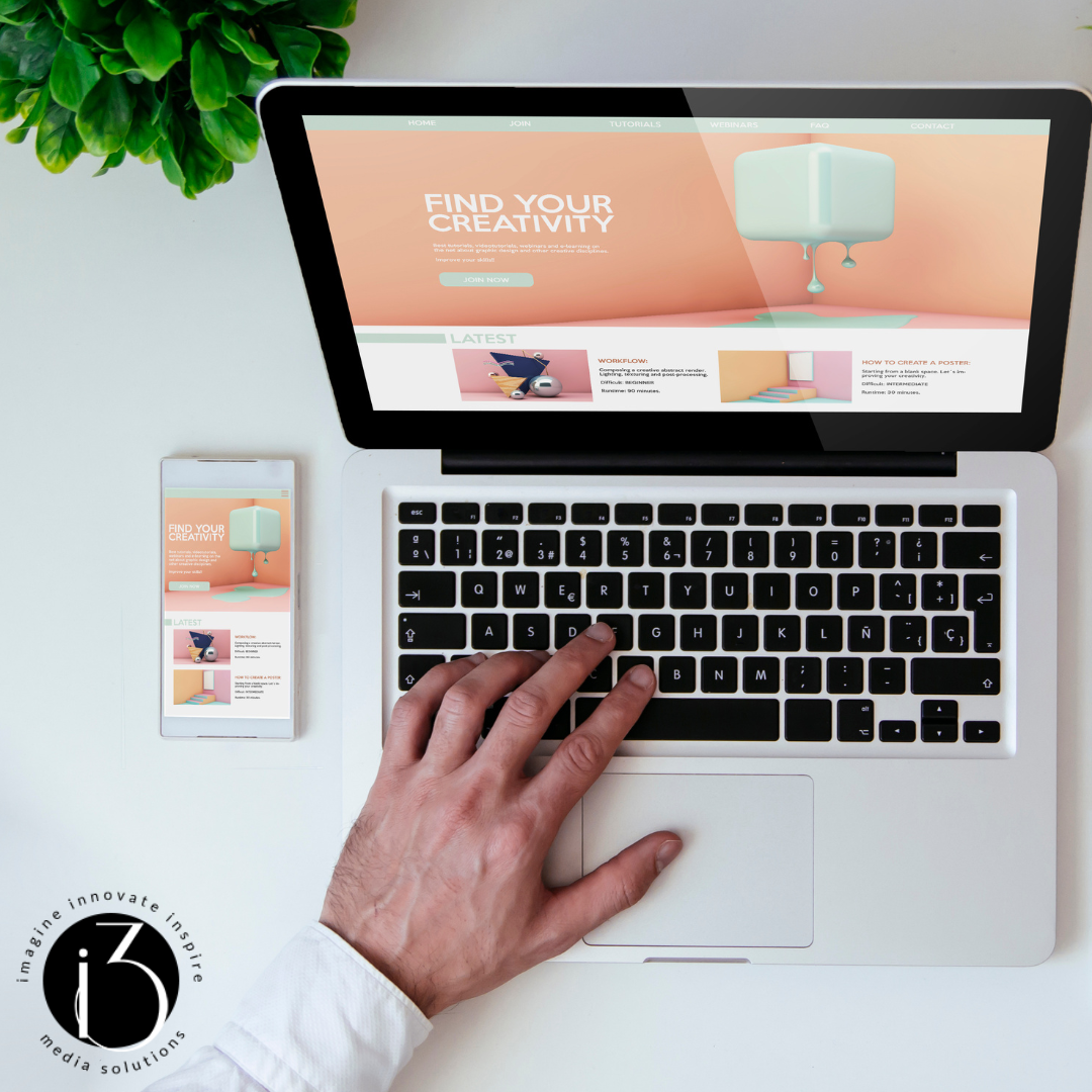
Every business needs a website. We can't say that enough. Why? It's not only a…
Design Related First Impressions
Obviously having a user-friendly website is key to gaining new customers, but what exactly does being “user-friendly” entail? Such aspects as color or font choices, a clean layout, efficient loading, and placement of certain details can subconsciously affect a potential customer in their pursuit of a relationship with your business. Building a website quite frankly becomes a game of psychological manipulation, with 94% of first impressions being based on design aspects. You must create a page with a design capable of conveying professionalism and trust as soon as someone opens it.
Forty percent of internet users will leave a site if it takes more than three seconds to load and that number almost doubles after five seconds. Making website content easy to load is one of the first elements that can impact the experience a potential client will have with your site. All the content must be able to not only easily load on a desktop computer, but on a mobile device as well.
Once the content has loaded, what kind of impression is it making? Is there too much text, or not enough? What about dominant colors and pictures?
Taking your target audience into consideration when planning out your website design can dictate which colors or pictures need to be present to give the right first impression. For example, blue is often a color chosen for sites that need to portray a feeling of trust, such as PayPal. As soon as someone clicks on the PayPal page, they are presented with a calming, blue color scheme. As far as pictures or graphics are concerned, human faces tend to draw the most attention and captions are often the most commonly read text.
Another obstacle in website design is the amount of options present on the homepage. While multiple option buttons linking to additional content on the website are hard to avoid, limiting them is beneficial. A clean layout, with minimal and easily visible buttons is key. If a person is presented with too many options, the overabundance is demotivating and can cause a user to abandon the site in search of one that is less demanding.
At i3, we are dedicated to taking all aspects of website design into consideration and building a website for our customers that is original and carries with it a positive first impression.


This Post Has 0 Comments