
When is the last time you updated your website? If you don't remember, that's not…
Is Your Website Responsive?
Years ago, in order to have websites that looked good on both desktop and mobile devices, website developers had to build separate sites using different designs for each gadget. Not only did this mean building multiple sites, it also meant managing content and SEO updates in numerous systems. It was time-consuming, inefficient, and costly.
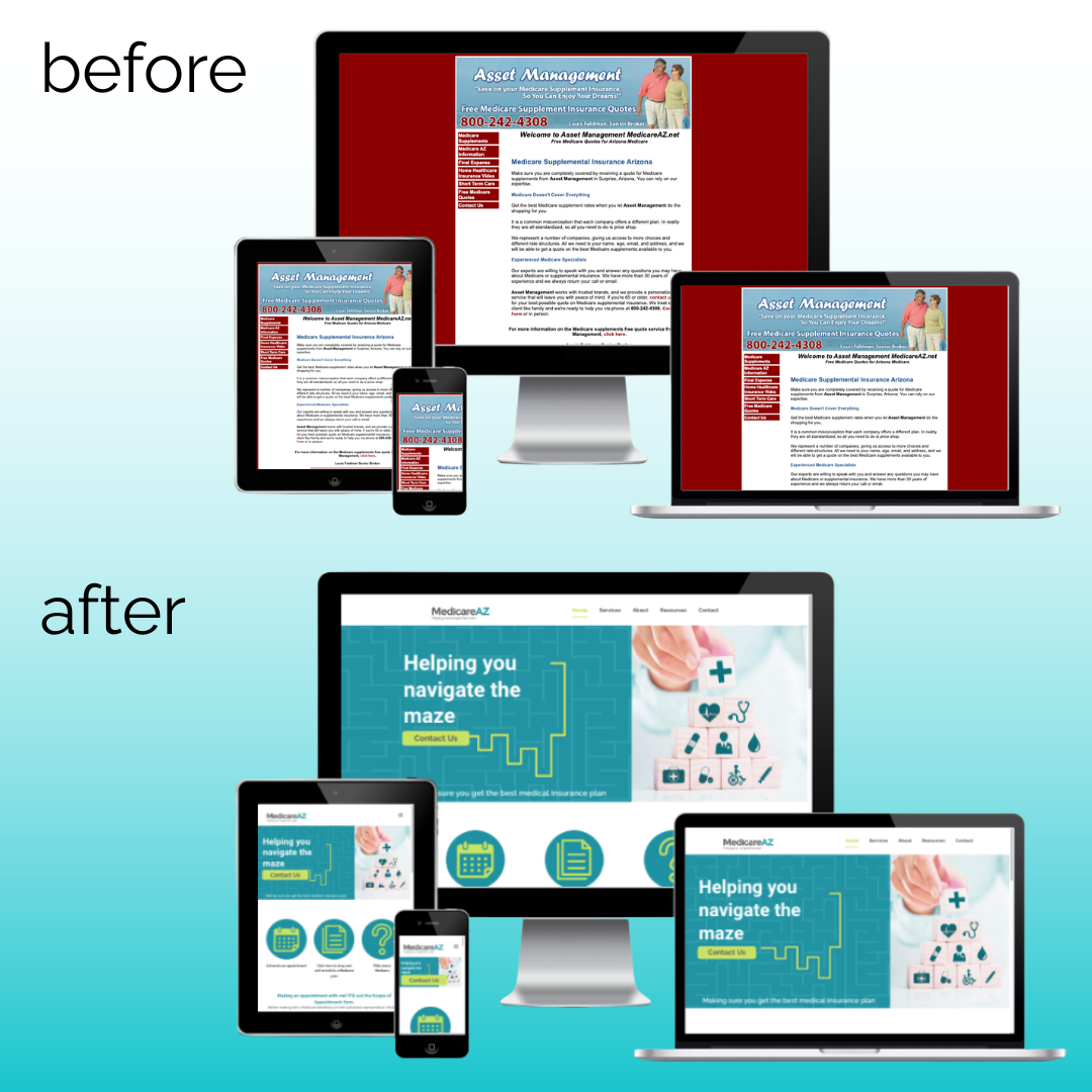
Then along came Responsive Website Design (RWD), a technique used to build websites so their size and design automatically adjust to the device. Not only do responsive sites save time and money by allowing you to focus your maintenance efforts on a single site, but they also increase your reach by making it possible for internet users to view your site on any device. Best of all, the improved user experience is shown to lead to more conversions and sales.
You may not be sure if you have a responsive website, but it’s easy to find out. In this video, i3 Media Solutions founder Frankie Lemer demonstrates how you can quickly test your site to see if it’s a responsive website.
Related Posts


Comments (0)